

Saralnama
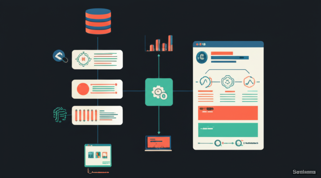
This article explains how to develop a simple dashboard by integrating several Python tools to visualize JSON data. It covers using JSON as a data format, DuckDB as an in-process analytical database, Streamlit for interactive dashboard creation without needing web development skills, pandas for data manipulation, and Plotly for interactive charts. The process involves loading JSON data into a pandas DataFrame, caching it for performance, registering it as a DuckDB SQL table, and dynamically querying it based on user-selected filters in the Streamlit sidebar. The dashboard displays the filtered data and visualizations including scatter plots, bar charts, and line charts, all interactive via Plotly. The article provides step-by-step code examples for setting up the environment, connecting to DuckDB, reading JSON data, building SQL queries dynamically, and rendering the dashboard. This approach enables non-technical users to gain insights from complex data through an intuitive interface. The author, Cornellius Yudha Wijaya, is a data science assistant manager who shares Python and data science tips. (Updated 22 Aug 2025, 18:48 IST; source: link)